
An identity for the practice itself: a wordmark, a coordinate and an intro screen that sets the tone before the work begins.
Studio Six is a brand design practice for founders, artists and organisations who want a clear, considered identity. For its own brand the brief was simple: a mark that points to the work rather than the studio.
The result is a small set of marks, a coordinate stamp and a compact type system - the same system this page is built from.
Studio Six works from Nº 06, Maritime Quarter, on Swansea Bay. That address became the brief. The marina coordinate is built into the identity rather than laid on top of it.
Where most studio identities announce themselves, this one is quieter: a mark and a system that read as considered and useful first - a coordinate more than a logo.
It is held to one standard - every decision deliberate, every detail clear on inspection, nothing overstated - and it had to work across business cards, the intro screen and the website.
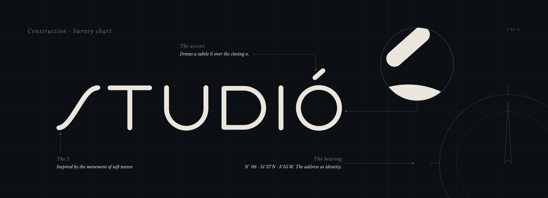
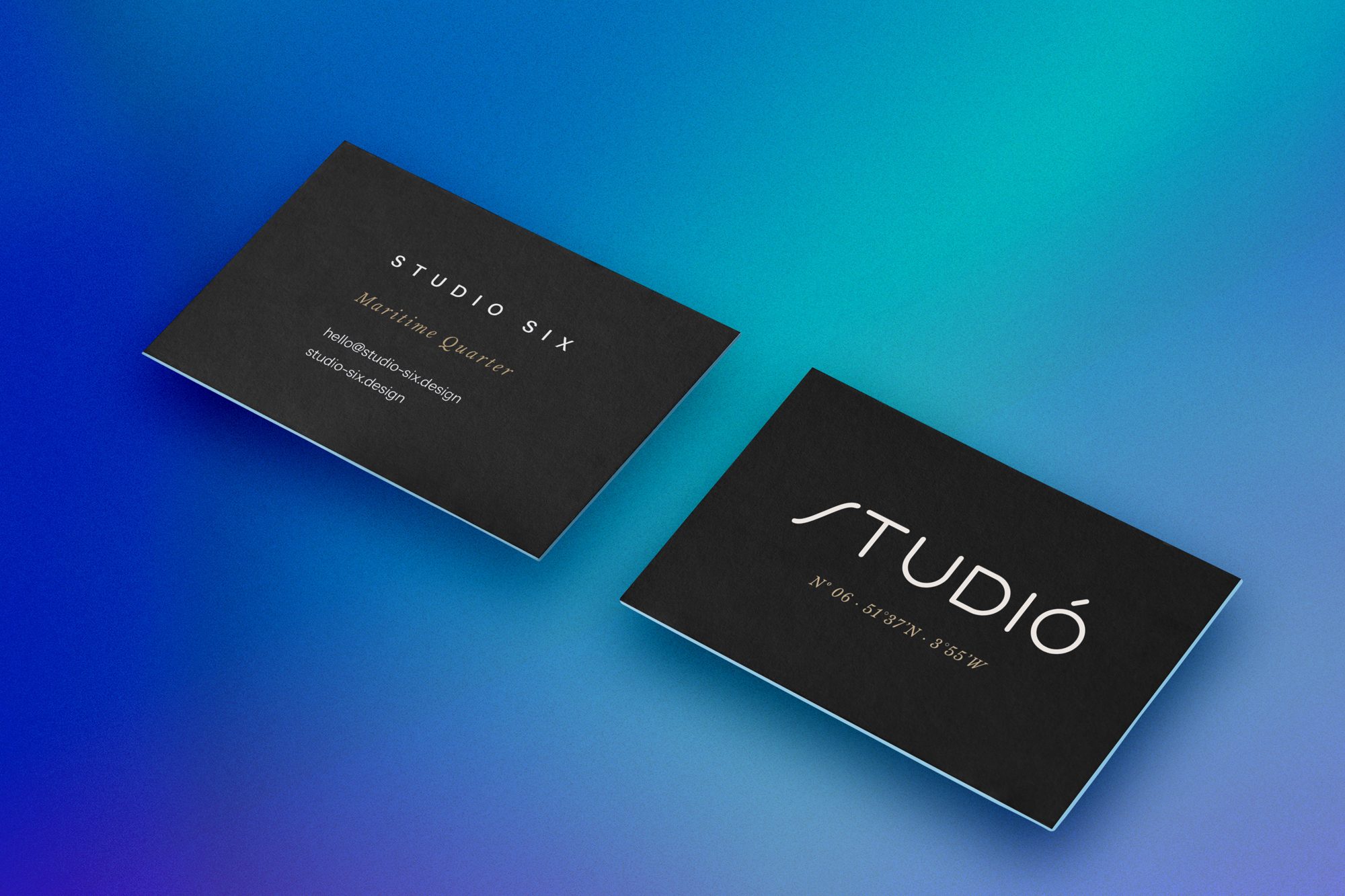
The wordmark carries an accent over the closing ‘o’ of Studio. Drawn as a subtle ‘6’, it reads first as a mark, then, on a second look, as the studio's number. The ‘S’ is drawn inspired by the movement of soft waves, kept soft without becoming fussy, and it anchors the wordmark. Beneath it sits the bearing, Nº 06 · 51°37′N · 3°55′W, the studio's own coordinate. Mark and bearing appear together on every business card, footer and intro screen.
The system runs on three typefaces and a dark/light tonal pair. Sora carries the display voice: headlines, pull-quotes, the numbered concepts. Instrument Sans does the working register: body at 18px, navigation, the tracked caps labels at 12px and 0.18em, and it closes every colophon. Libre Baskerville appears only in italic - the editorial accent for standfirsts, eyebrows, markers and captions.
The palette has a total of fifteen tokens. Cream-context tokens for the body of the work, and dark-context tokens for the hero, contact and intro screen. A maritime accent (#3D5A6C) and a warm sand (#B8A375) carry the construction diagrams and promotional graphics; neither appears in the running text.
Display, system, accent. One face for each role.
Paper
#F3EFE8
on light
Paper warm
#EAE4DB
on light
Ink
#1A1A1A
on light
Ink soft
#4A4A47
on light
Maritime accent
#3D5A6C
on light
Ink mid
#8A867D
both
Stroke rule
#D6D1C7
both
Intro base
#0A0D12
on dark
Ink dark
#0C0F13
on dark
Text light
#EBE6DC
on dark
Text light soft
#A8A39A
on dark
Muted light
#6E6A60
on dark
Rule light
rgba(235, 230, 220, 0.14)
on dark · alpha hairline
Sand
#B8A375
on dark
Stone warm
#A79B80
on dark
The site opens on a quiet atmospheric field: low cloud drifting across the frame while the wordmark resolves from blur into focus over about four seconds. It plays once per visit, and returning visitors go straight to the studio.
From there the page moves into cream for selected work, a warmer cream for the about section, and closes on the same dark tone it opened in, so it begins and ends in one register.
The wordmark itself took restraint - the ‘S’ was refined, over-refined, then pulled back to a version with more life. The same discipline runs through the rest: fifteen colour tokens, three typefaces, a dark-cream-dark rhythm and an intro held to a single play.

A signature lockup for dark settings.
“The address became the identity.”Brand thinking
From reference to resolved.
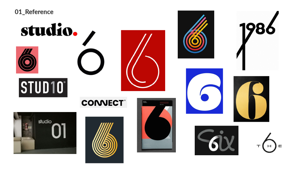
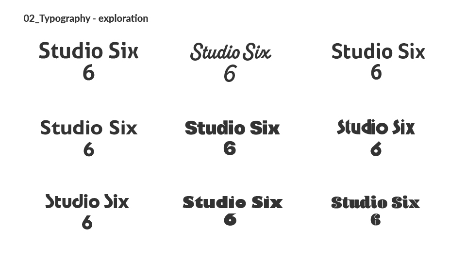
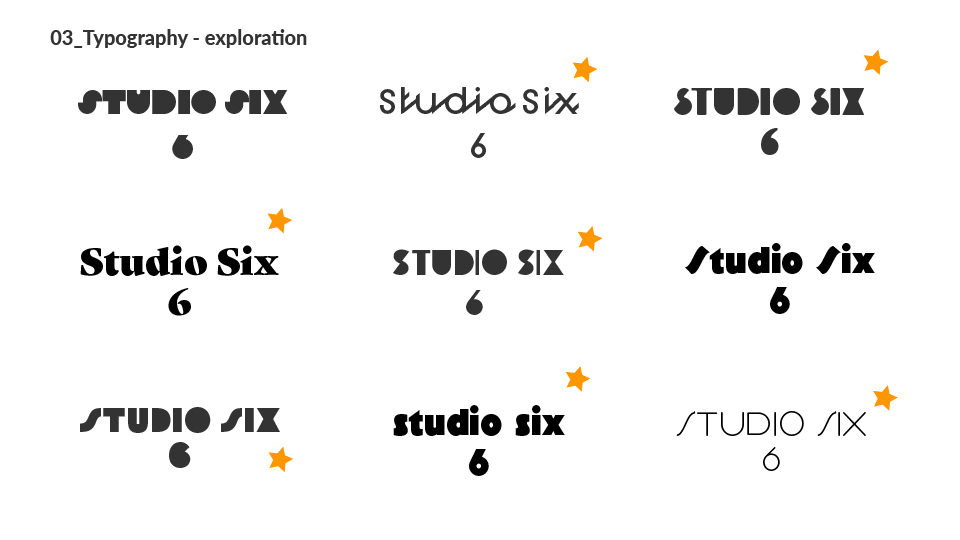
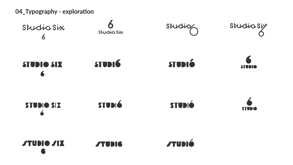
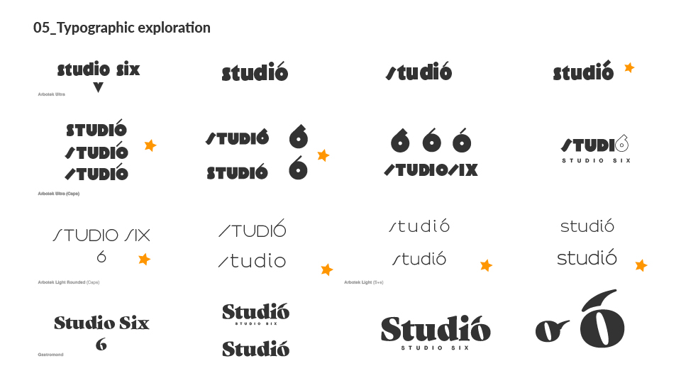
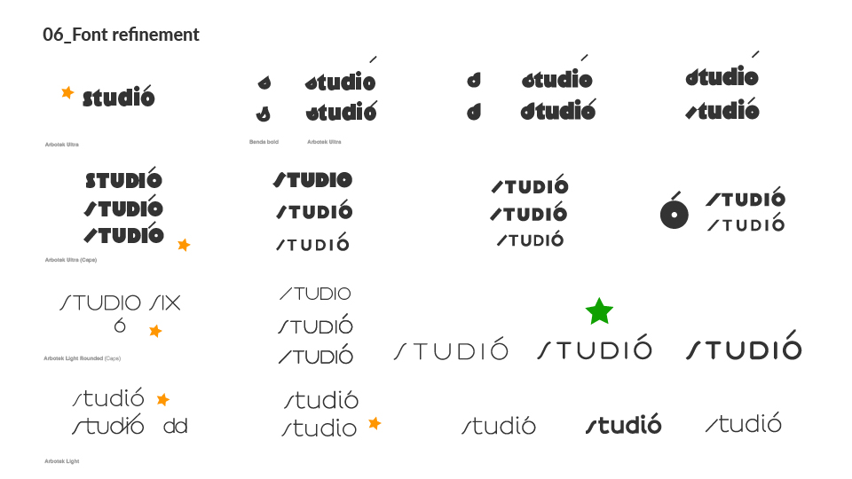
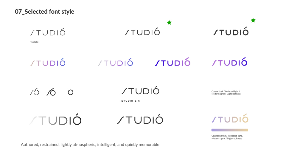
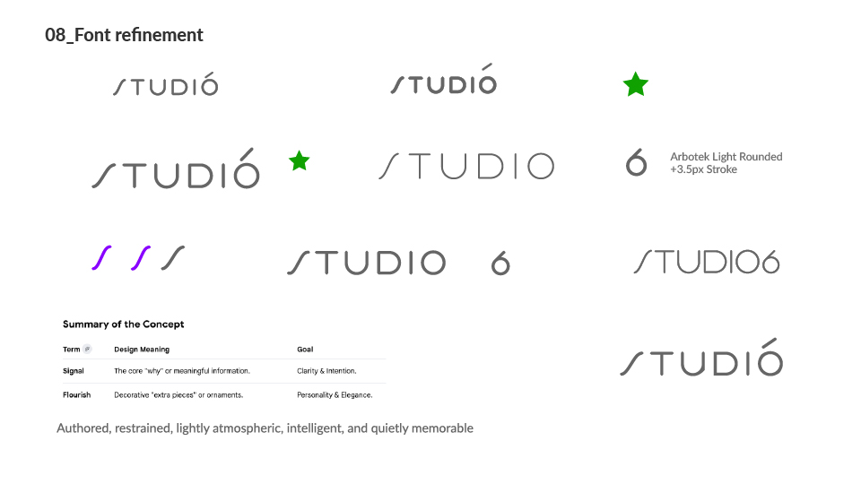
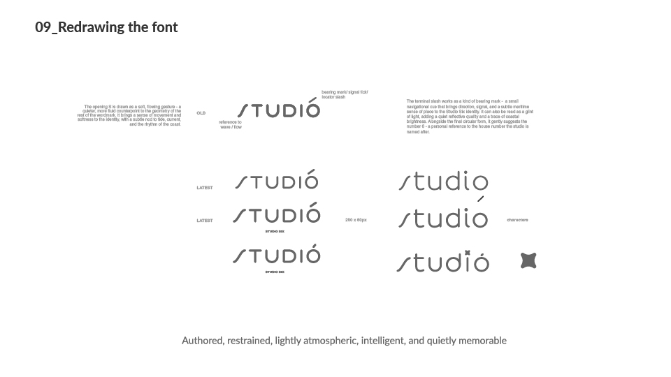
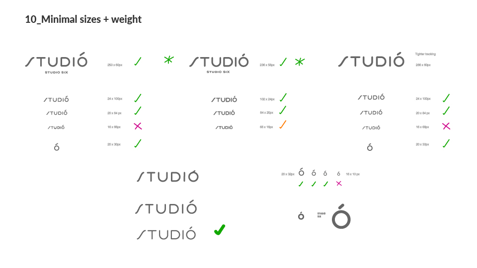
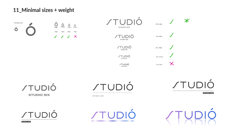
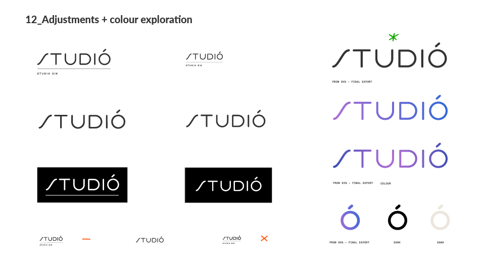
Reference and ideas, typographic styles and exploration, final mark refinements.
Where the marine references came from - concepts rather than literal forms, small and precise.
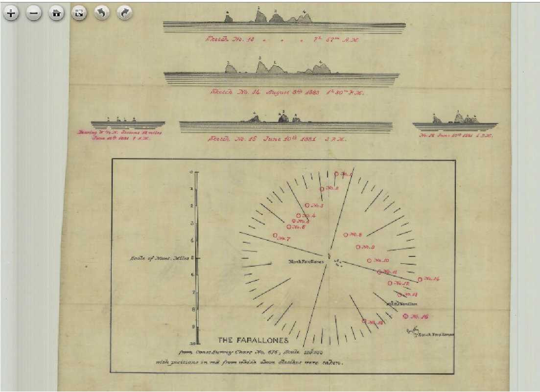
Coast Survey chart - the attitude beneath the bearing.
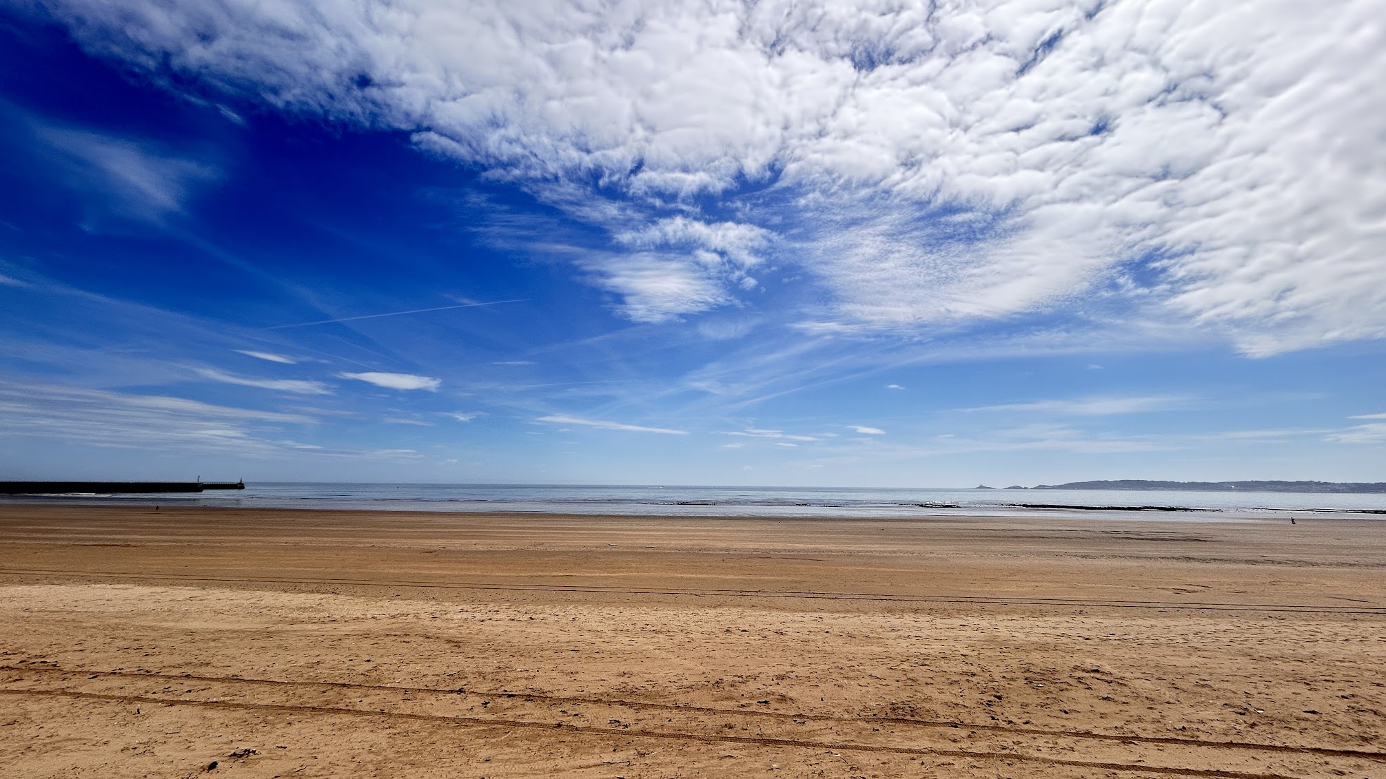
Maritime Quarter - the place coded into the mark.
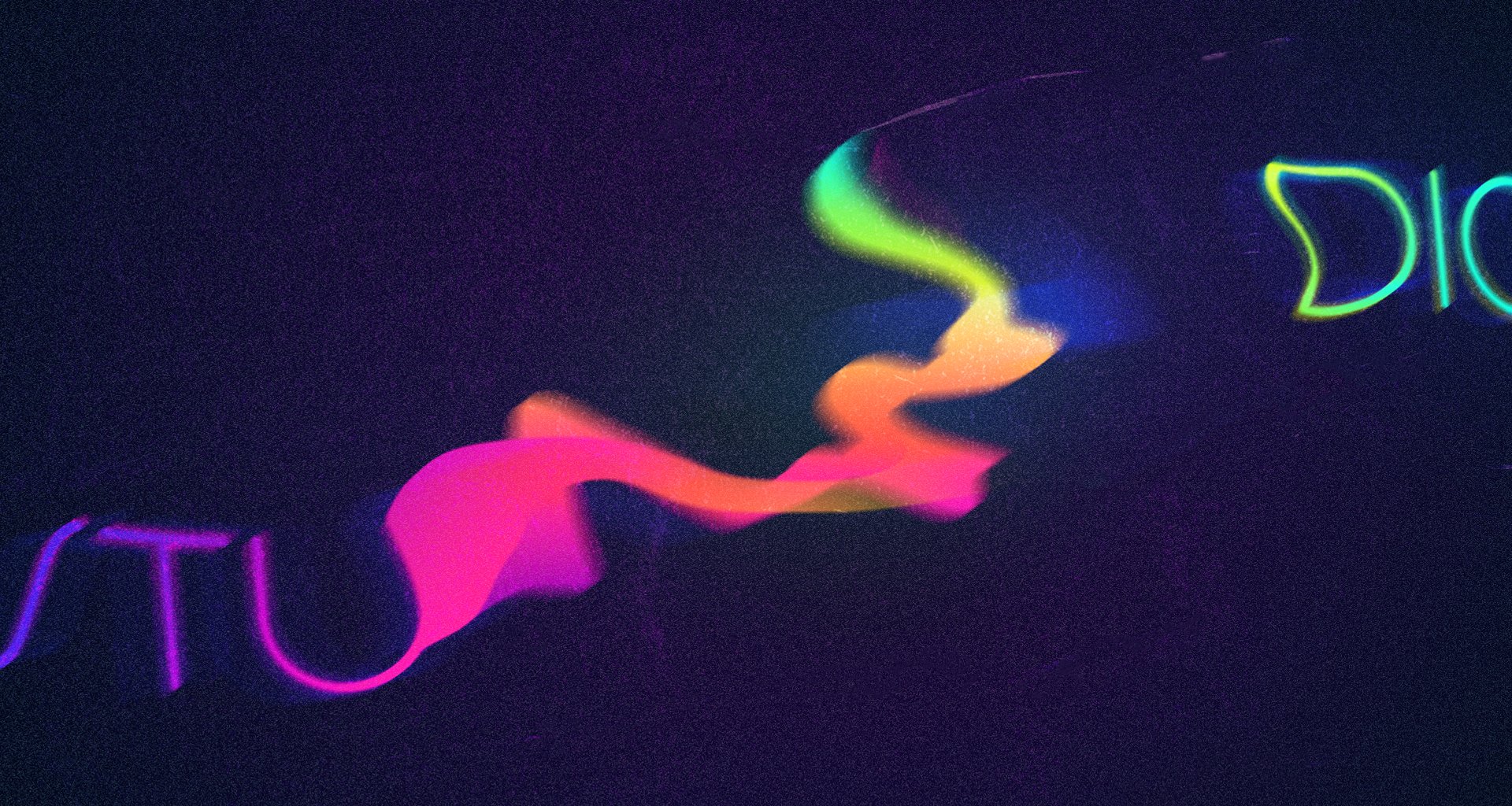
Early experimentation in Photoshop for intro screen concept.

Abstract wave graphic exploration