A rebrand for a London front-end agency built around clarity, collaboration, and the craft of clean code. A precise linework mark, a bright teal signal, and a system made to feel open, direct, and easy to use.
The Digital Detox identity sits where design, code, and delivery meet. Responsive websites, accessible interfaces, high-performing products, and close collaboration with global brands shape the brief. The team describes its work as refreshingly clear; the identity makes that visible.
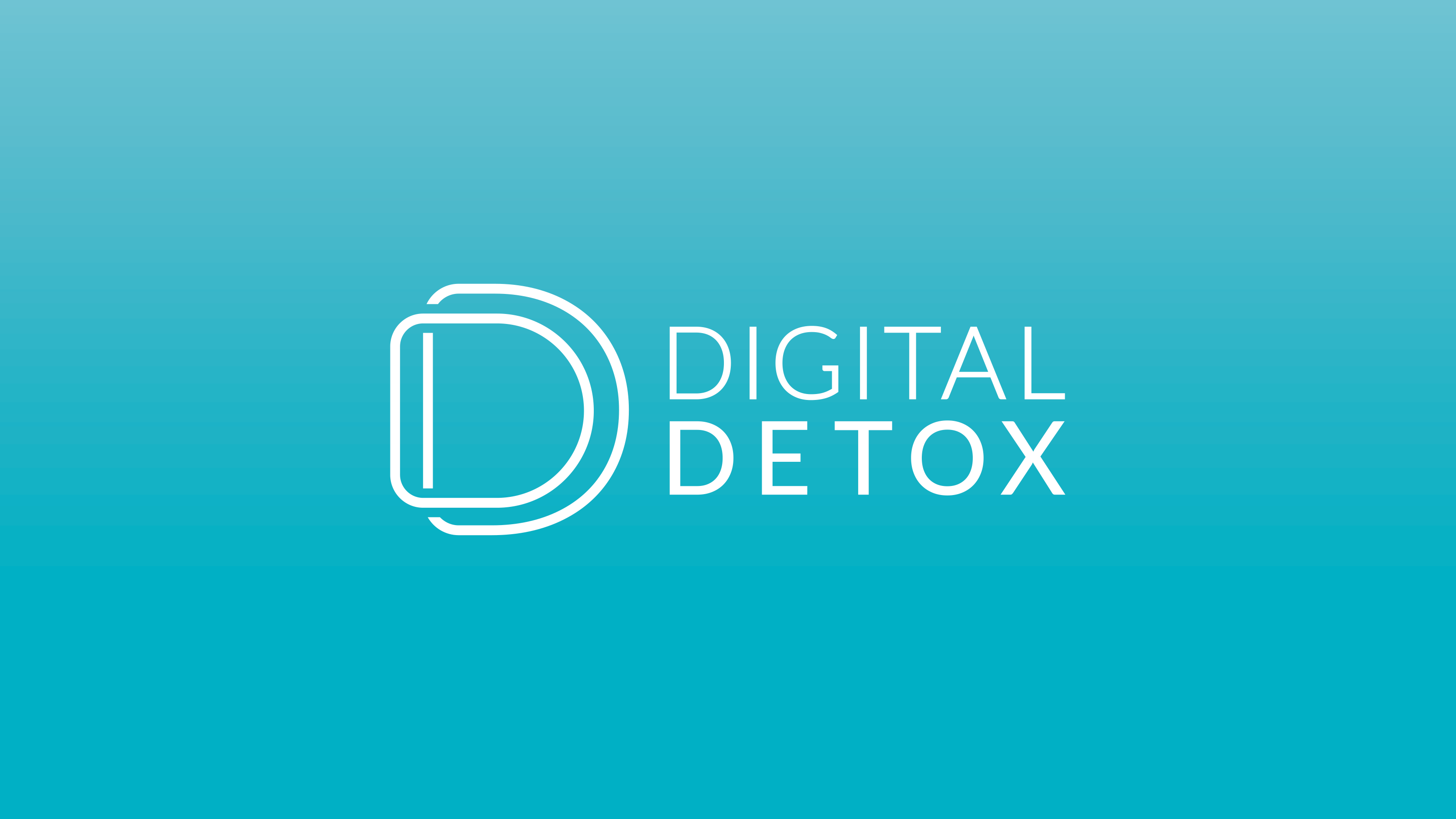
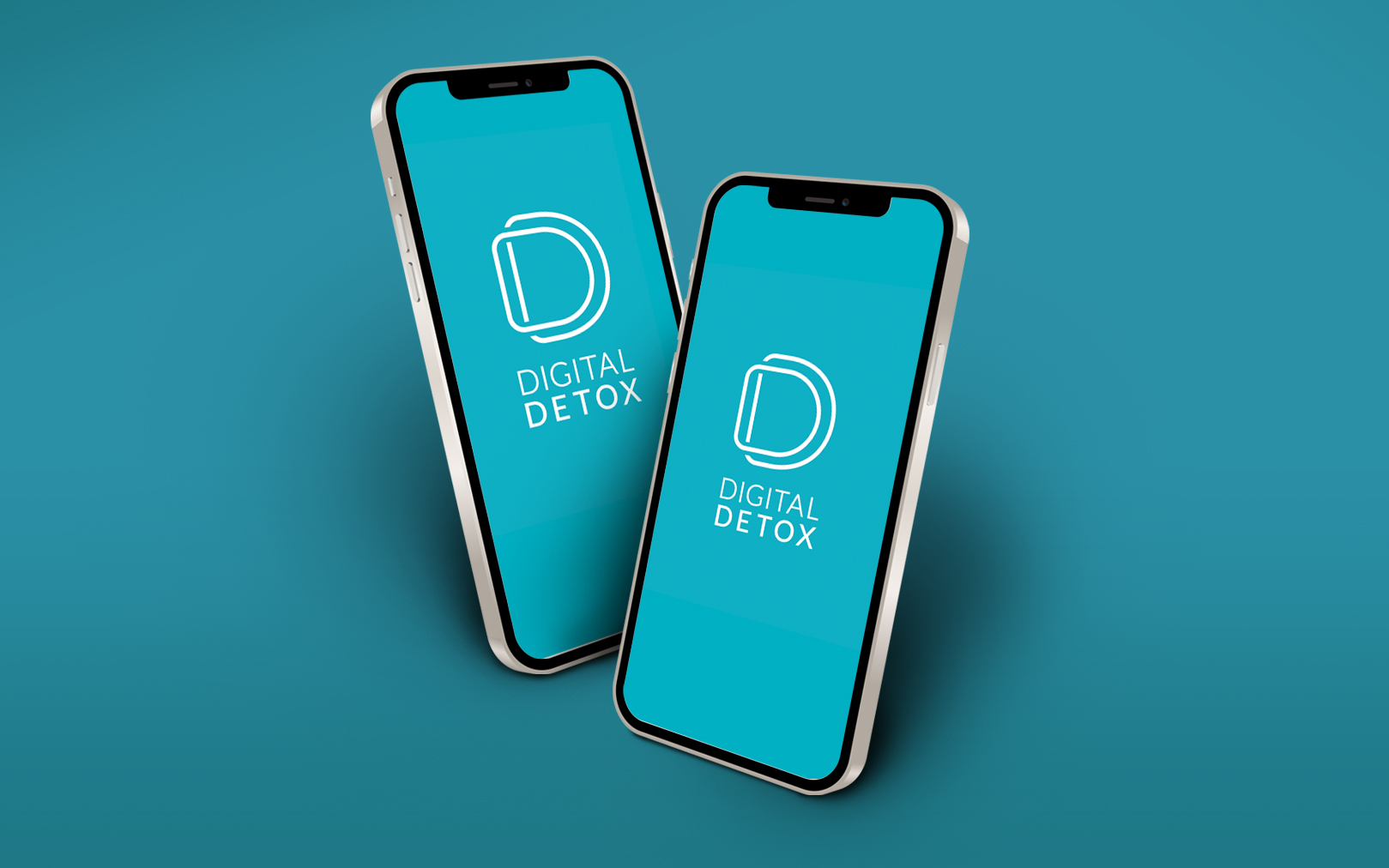
The rebrand is a precise linework mark, a single bright teal, and a light geometric wordmark - a clean, direct system that works across screen, print, and exhibition.
Digital Detox wanted the opposite of the busy agency language around them. No unnecessary effects, no visual noise, no cleverness for its own sake. The brand needed to reflect how the team works: clean code, clear processes, and close collaboration.
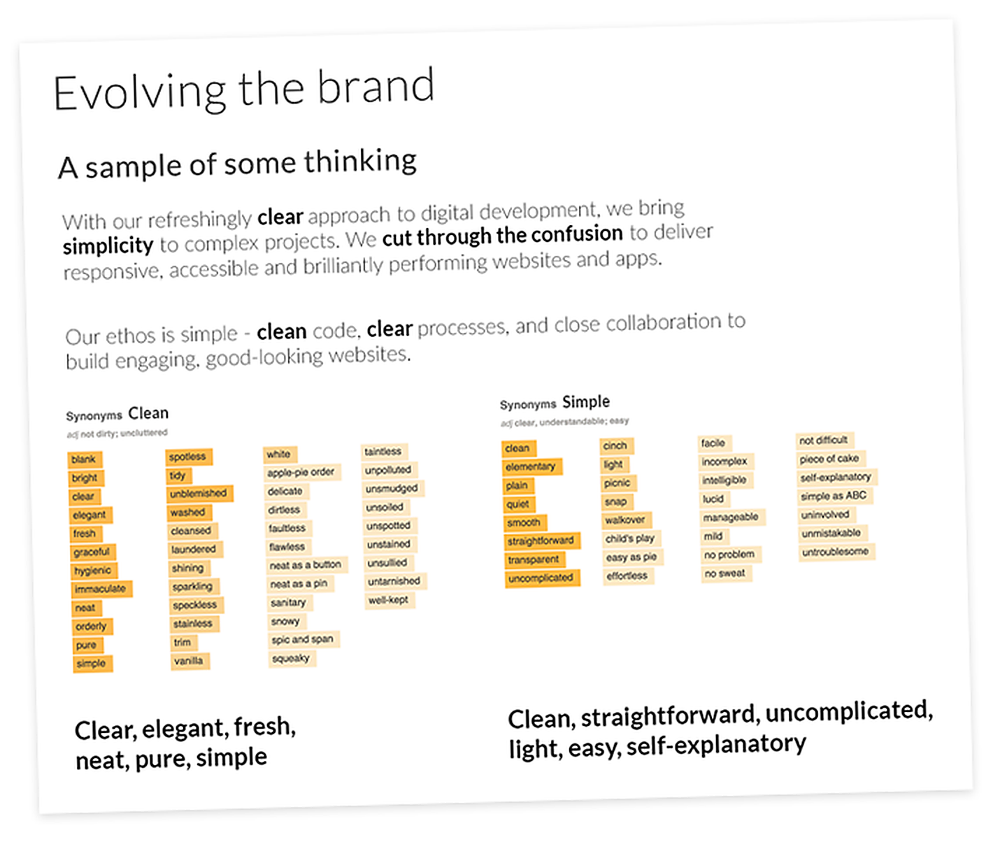
Through a branding principles workshop, the team defined the words Digital Detox needed to stand for - clear, elegant, fresh, neat, pure, simple; straightforward, uncomplicated, light, easy, self-explanatory.
Those words are the measure for the identity: open, precise, and easy to understand at first glance.
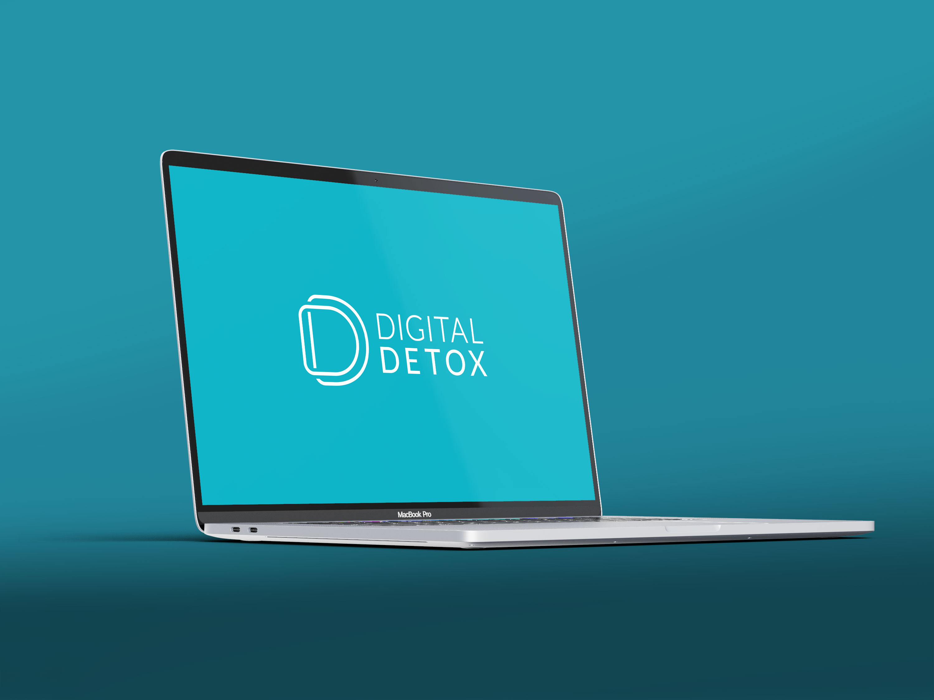
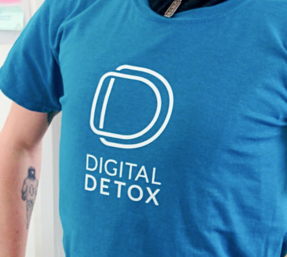
The mark reads in two ways. Up close, it works as a DD monogram - the Digital Detox initials drawn into one form. Stepped back, it becomes a single letterform with a doubled outline: a clean visual reset, not a decorative effect.
The linework stays deliberately light. A heavier mark would work against the positioning. This one keeps the identity open and precise, scaling from favicon to exhibition banner without losing clarity.
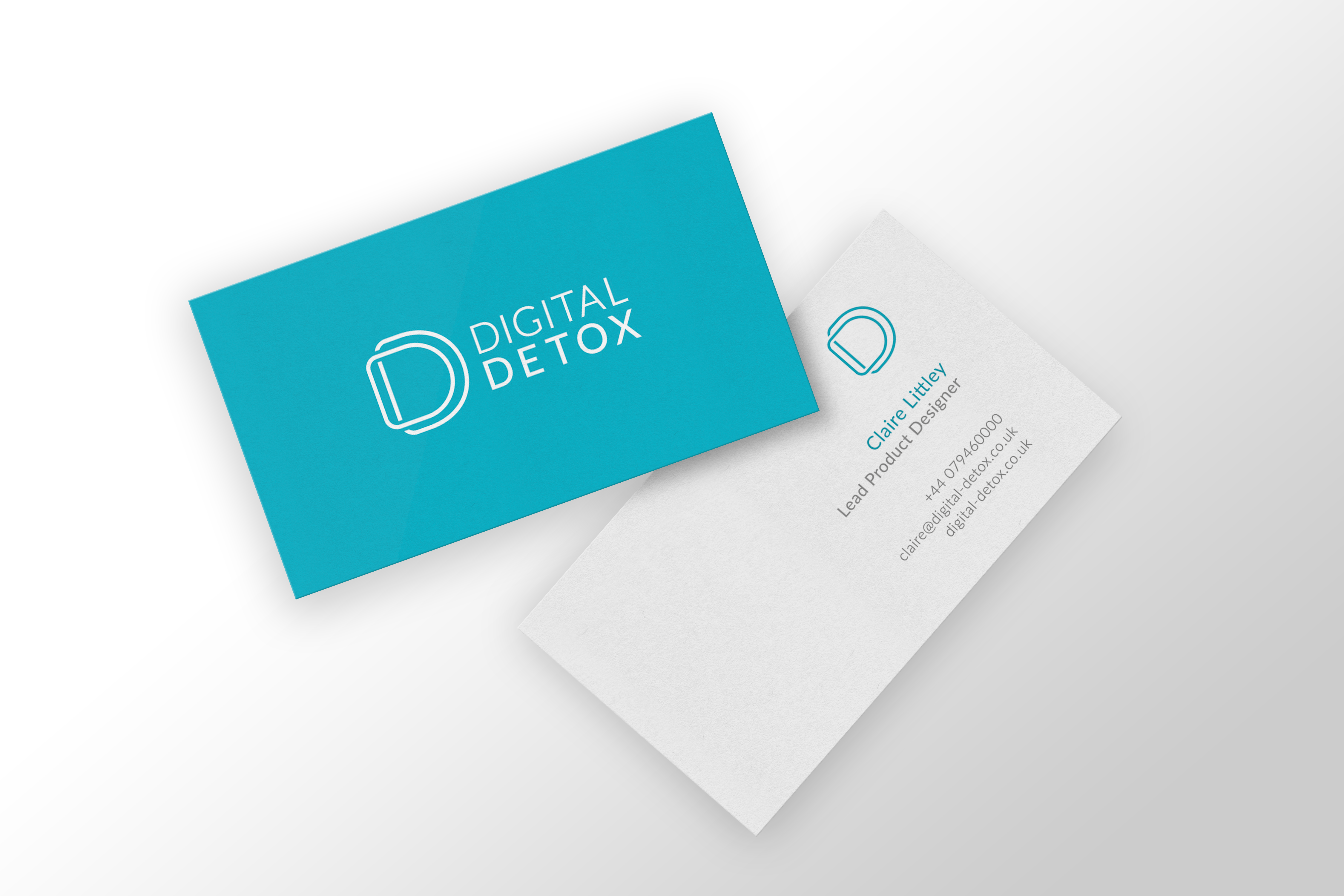
The system is deliberately spare: a single teal accent, white space, and a light geometric sans. The teal gives the identity enough signal to feel distinct, without relying on the blue-grey palette often used by technical agencies.
Type follows the same logic: one family, one weight, used consistently. The mark carries the only decorative role in the system, and even there the linework stays light.
"Clean code, clear processes, close collaboration."Brand thinking
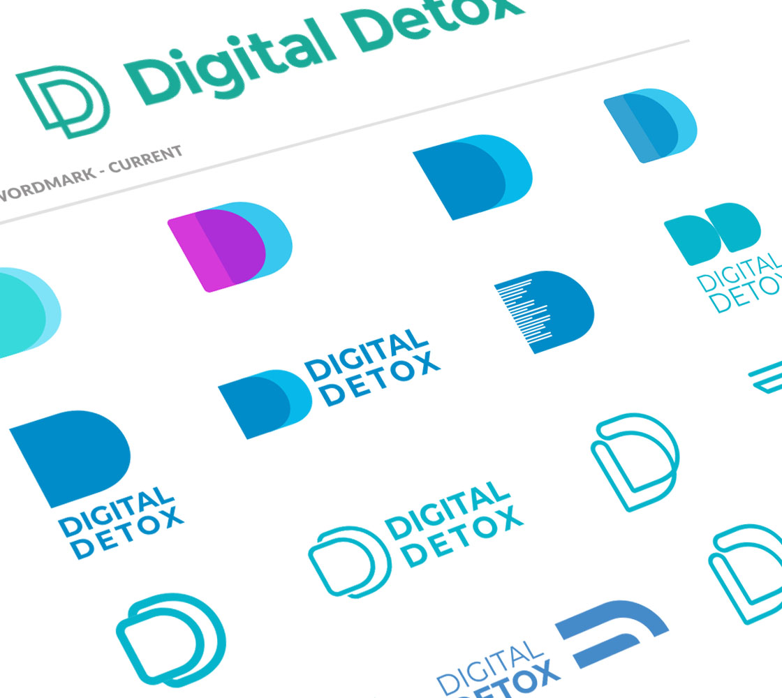
The process moved through dozens of D studies: solid shapes, tracing-paper outlines, lower-case forms, geometric monograms, bold blocks, and hairline drawings. A second route was developed in parallel - a horizontal-bars mark that leaned more toward infrastructure and code.
The selected route had the clearest relationship to the name: a doubled D, reduced to a light outline. Type exploration then focused on finding a wordmark that would not overpower the mark, moving through Lato Light, Quicksand Light, Proxima Nova Thin, and Montserrat before settling on an upper-case Lato lockup with generous tracking.