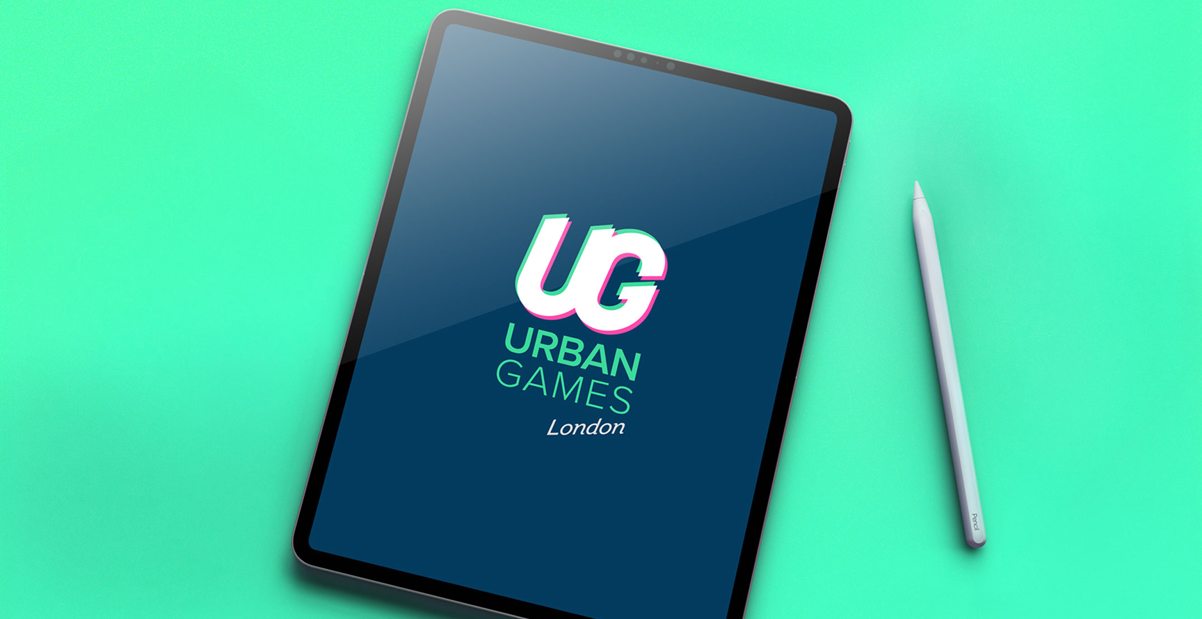
Final lockup
An identity for a London urban-sports event with global ambition. Movement, balance, strength - compressed into a single chromatic mark.
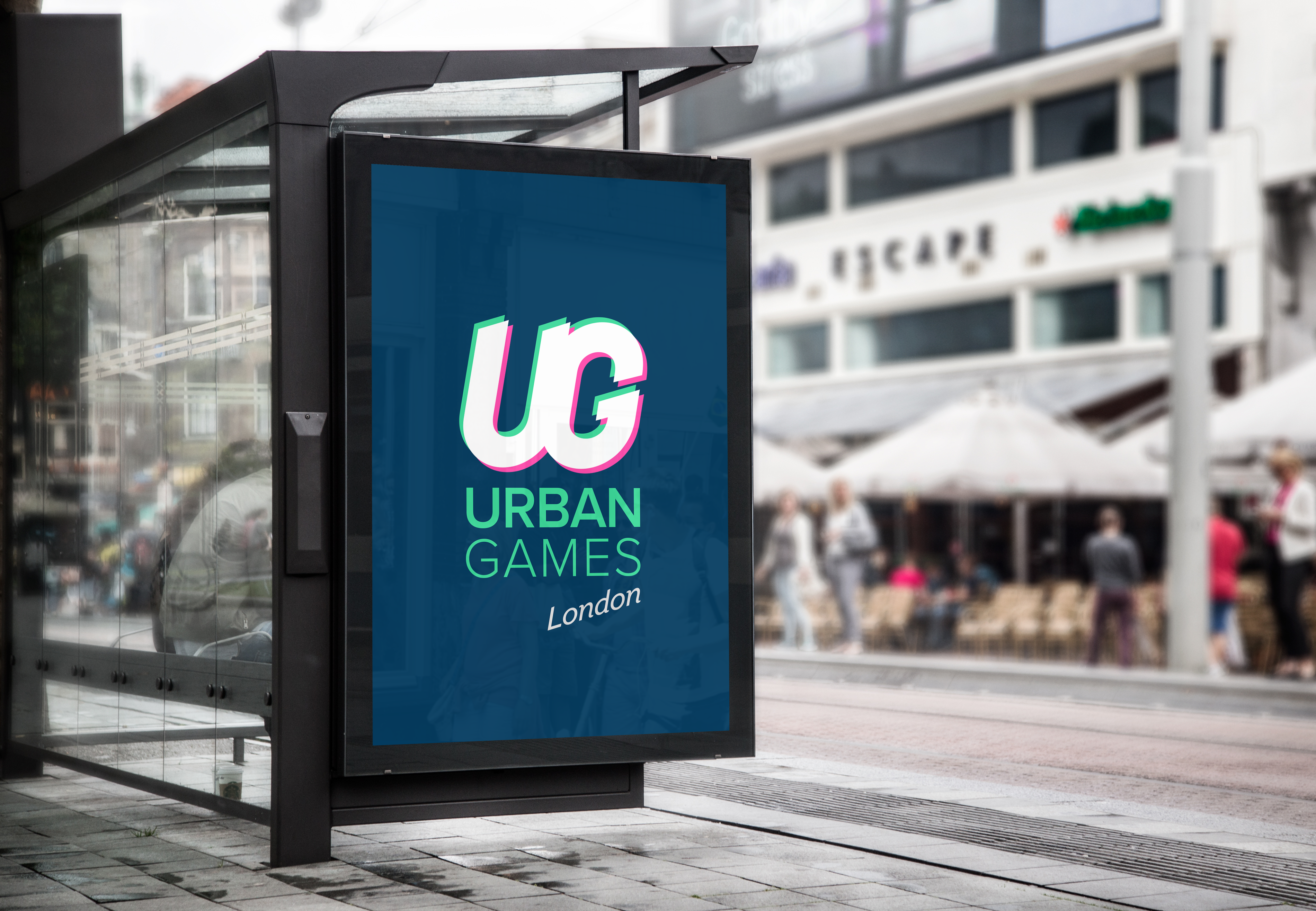
Urban Games was created for a London event bringing together BMX, parkour, skateboarding, climbing, and other urban sports, with the ambition to expand into other cities.
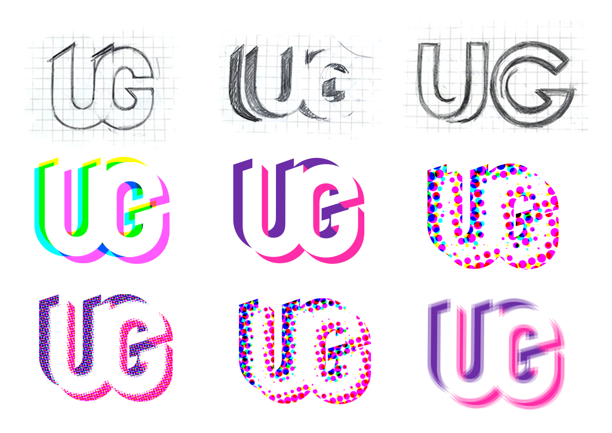
The identity needed energy, impact, and a clear event presence - without relying on the usual clichés of urban sport. The final system centres on a chromatic UG mark: a single letterform split into white, mint, and magenta layers. Paired with a clean wordmark and an italic London signature, it feels active without becoming complicated - built for posters, screens, signage, and event graphics.
The client wanted an identity that felt young, dynamic, and vibrant, without relying on the usual visual cues of urban sport - extreme angles, distressed type, action shots, and fake grit.
The work started with the qualities these sports have in common: movement, balance, and strength. The mark needed to carry that energy in a still image - bold enough for the event, but controlled enough to eventually become a system.
The chromatic split comes from print mis-registration and screen-based motion; familiar cues for speed, impact, and energy. Mint and magenta sit slightly apart from the white centre, giving the mark its sense of shift.
The result is static, but not still. The offset carries the movement; the white centre keeps the form clear, balanced, and legible.
The system is built from deep teal, white, mint, and magenta. Teal gives the identity its field. White holds the mark. Mint and magenta create the offset - adding movement, contrast, and impact without needing additional graphics.
The wordmark sits beneath in mint, with London set in an italic serif. That small shift in tone gives the lockup a sense of place and softens the harder geometry of the UG mark.
"Movement made still. Balance held in the white; energy carried in the offset."Brand thinking
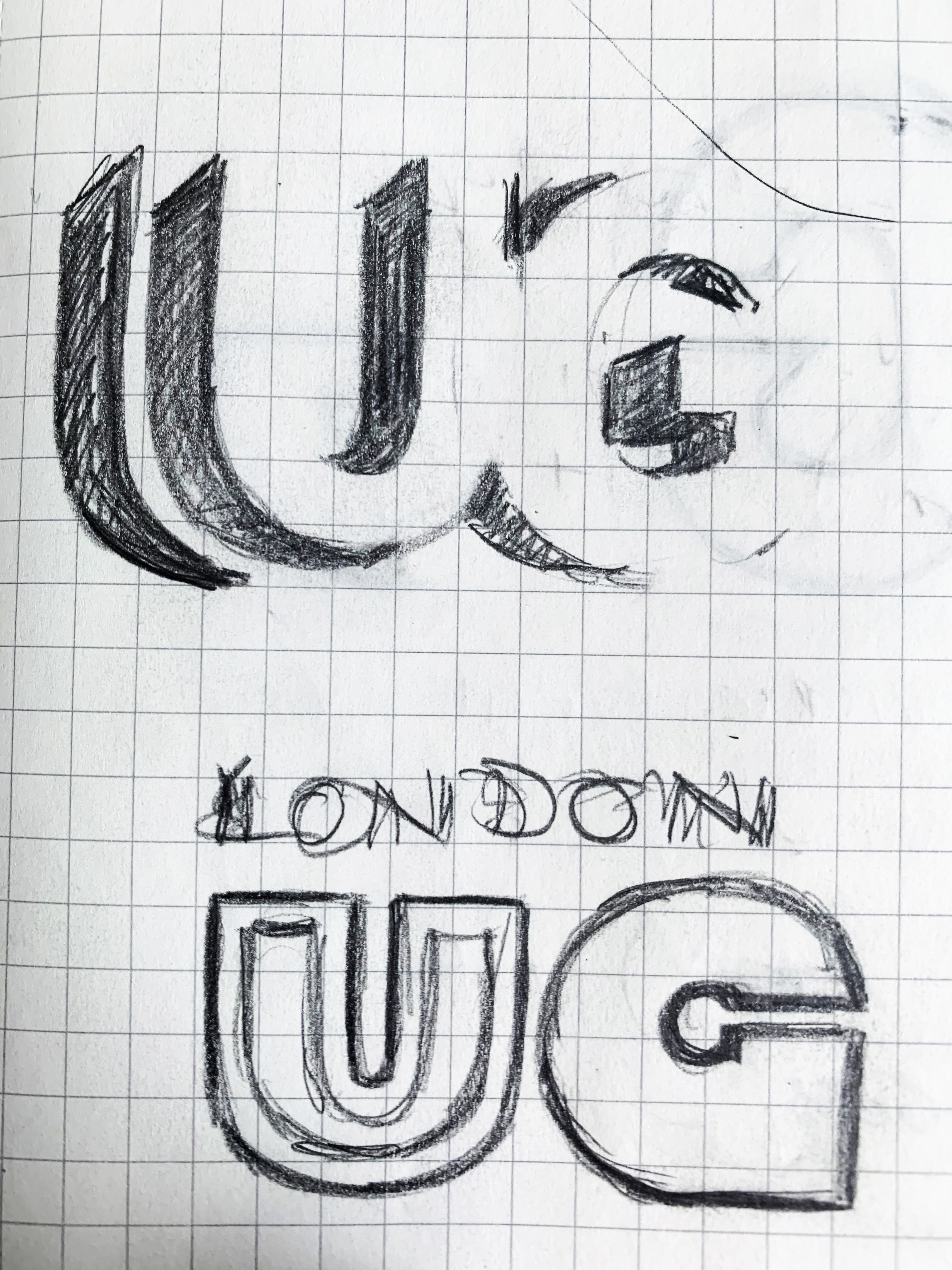
The process began with a wide set of routes: heavy display type, hand-drawn initials, geometric constructions, single-letter marks, and abstract studies around movement and impact.
As the options developed, the strongest direction became clear: a compact UG mark that held energy without needing to describe the sports directly. From there, the work was in the detail - adjusting the offsets, refining the italic angle, balancing the white centre, and finding the right depth of teal.