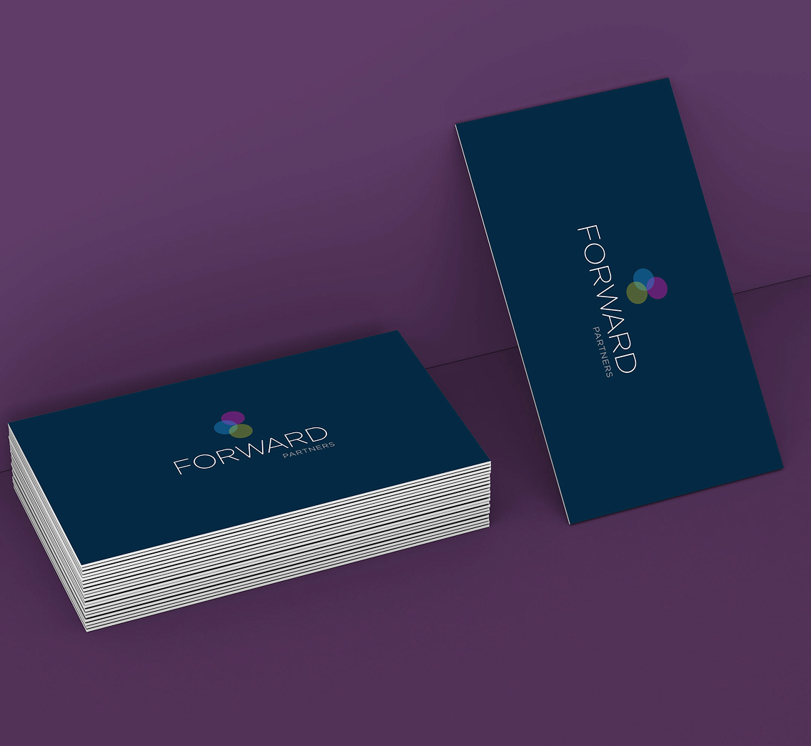
Brand frontispiece - the mark and wordmark in their primary lockup, on Forward Partners navy.
An identity for a London VC partnering with start-up founders. Three values held in a single mark - the startup catalyst.
Brand frontispiece - the mark and wordmark in their primary lockup, on Forward Partners navy.
Forward Partners are a London investment firm building close, hands-on partnerships with early-stage founders. They don't just write the cheque - they sit beside the founders they back, sharing teams, knowledge and craft. The brief was to evolve the studio's identity in a way that read as seriously partnered, not corporately distant.
The work centred on a refined wordmark and a three-tone mark - three brand values held together as a single device. Built whilst working in-house with the firm and several of its portfolio companies.
The appetite for original thinking. The reason the firm sees potential before others do.
The steadiness that lets early-stage partnerships take shape. Patient, present, credible.
The measure the work returns to. Not a slogan - a standard every decision is held against.
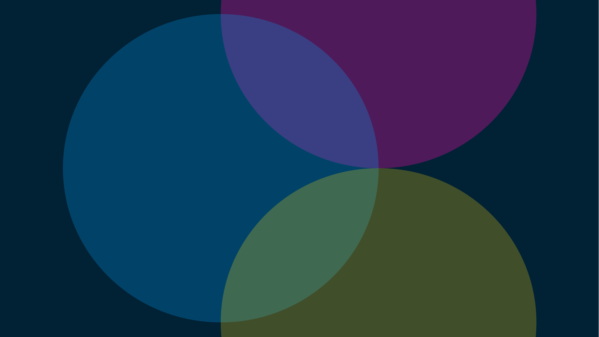
The mark borrows from chemistry - elements meeting to form a third - and the colour theory that carries the meaning. Each circle is its own value. Where they meet, they make something none of them could hold alone.
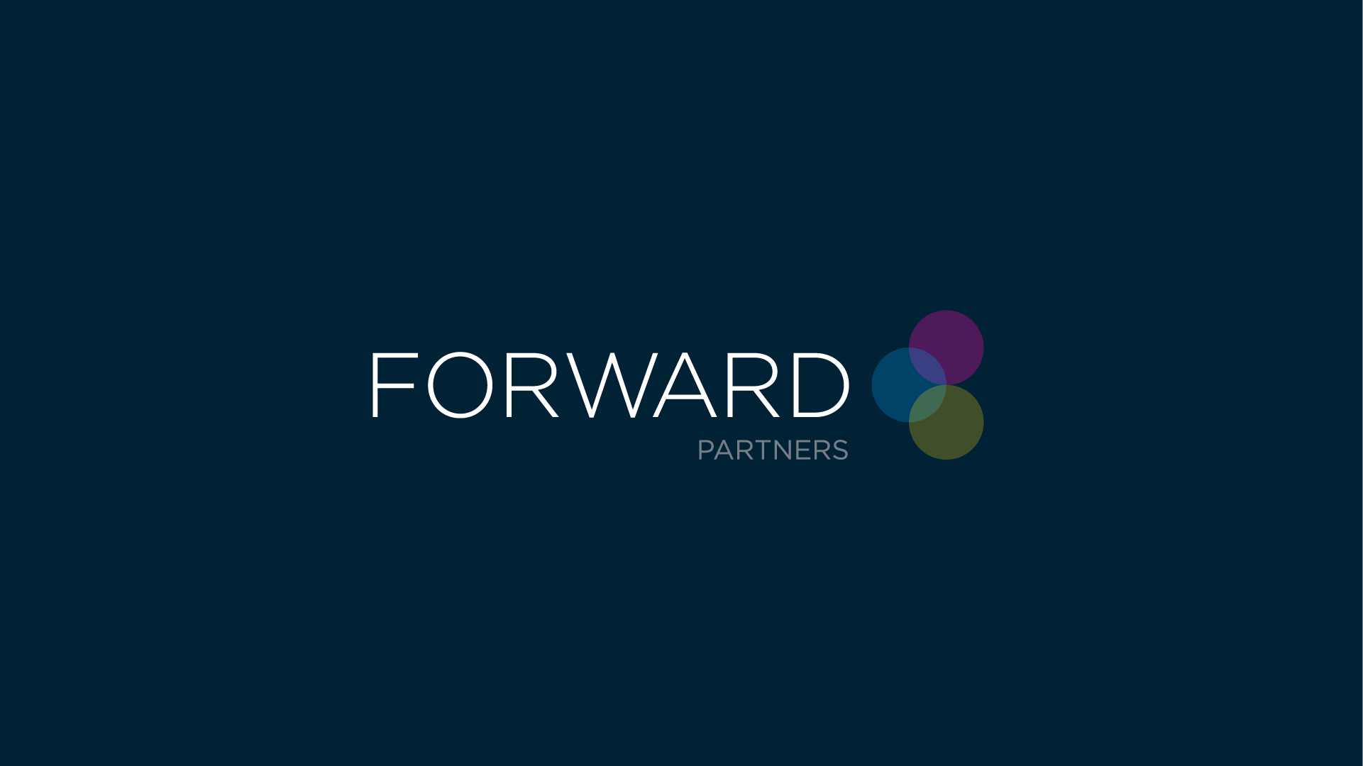
Designed to sit above or beside the wordmark, the mark works across dark and light surfaces, with the colours tuned for each. The dark register is primary; the light register is more formal - letterheads, slides, proposals, the finer details of partnership.
Three values combine to create something none could carry alone.
Elements meet, react, and produce a third condition.
The blending mode that allows the overlap to appear.
The wordmark is set in Gotham - Extra Light for FORWARD, Book for PARTNERS - chosen for its geometric calm and its place within serious modern identity systems. FORWARD sits at full width, generously tracked. PARTNERS sits beneath it, more grounded - doing the supporting work the firm itself does for its founders.
Portrait and landscape lockups keep the same proportional relationship between mark and wordmark, so the brand reads consistently across tablet splashes, slides, documents, and footer signatures.
Logo - Mono on-dark
Logo - Colour - On-light
"Three values held in a single mark - the startup catalyst."Brand thinking
The route to the final identity ran through dozens of explorations - early concepts around catalyst, chemical, and multiply, single-letter monograms, abstracted F-shapes, and several typographic-only lockups. The wall of workings was its own argument: a brand needs to look better than the version next to it, and the only way to know is to draw them all.
The selected route is the one that did the most with the least. Three colours. One geometric sans. A tight, restrained system that carries weight without raising its voice.